Navigating our new look: Exploring Orangefiery’s refreshed digital presence
You may have noticed that the Orangefiery website has a new look! As we mark our 10-year anniversary, we have updated (ever so slightly) our visual identity and added a significant amount of content to our website about our consulting solutions and our communications and public relations services. Given that we do branding and website development for our clients, it was time to apply our capabilities to ourselves.
Here’s an overview of what’s changed, we’d love your feedback on the evolution of our brand and website.
An updated Orangefiery brand
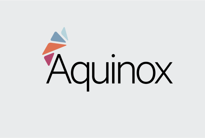
First, we quietly updated our visual identity. Last year, after 10 years with a visual identity that has served us very well, we realized that the initial line drawing done by friend and brilliant designer Nolan Haims needed a bit of a touch-up. At the inception of Orangefiery, Nolan’s design, which embodied the “start of an idea” felt perfectly “of the moment” for a new firm. Our founder, Mike, recalls the moment he chose the logomark. “Nolan had produced a set of great choices,” he says. “This was the least ‘safe’ option and I loved it for that.” We ran with it and it served us very well.
Ten years later, we’re in a slightly different place as a firm. A bit more well organized, more explicit about what we offer to our clients. So we went for a touchup, this time with the team at TANKindustries, with whom we partner on a lot of branding work.
The new logomark is a clean, single-weight line with an orbital that combines art and science – as we do in our communications and consulting work. The “squiggle” sits above and to the left of the wordmark, capturing the “curiosity” that is our lead brand attribute. The font, Baskerville, is a beautiful and classic typeface – categorized as a ‘transitional’ typecase between classical typefaces and high-contrast modern typefaces. (By the way, even though we stuck with the italicized ‘fiery’ in our logo, Orangefiery remains a single word.)
The distinction between our communications and consulting capabilities
As a strategic communications and consulting firm, we wanted to clearly articulate the two distinct things we do: consulting solutions and communications services. Our updated navigation contains separate pages for each, under capabilities, and more robust content describing the services.
Under consulting solutions, we describe a number of tools we deploy to solve problems. These include our market development services, advocacy engagement, strategic planning and branding. Each of these pages will provide information about our offerings in the space, along with links to relevant case studies.
Under communications strategy, we describe the work we do supporting the internal and external communications needs of our clients. Some of these services include communications planning, thought leadership and message development.
Of course, we typically do both strategic consulting work to address key challenges our clients face and support the boots-on-the-ground communications needs of our clients – that hasn’t changed. You can just start in either place now, much as our client engagements often do.
Our case study library
You will notice we have added a number of case studies to our website that reflect some of the work we have done in partnership with our clients. You can filter our library by industry or offering, allowing for even more streamlined results. We will continue to add more case studies and look forward to sharing the work we do with our clients and the impact it has had.
Explore our case studies to see how we’ve helped clients across various industries tackle complex challenges!
Insights to spark your curiosity
We are excited to bring back our blogs, which will continue to feature insights, industry trends and more. Through the years, we have written content on topics such as market development, leadership communications, as well as announcements or insights on who we are as a firm. Be sure to read The Power of Organizational Purpose, one of our most recent blogs. Keep an eye out for more content or let us know what you want to hear more about!
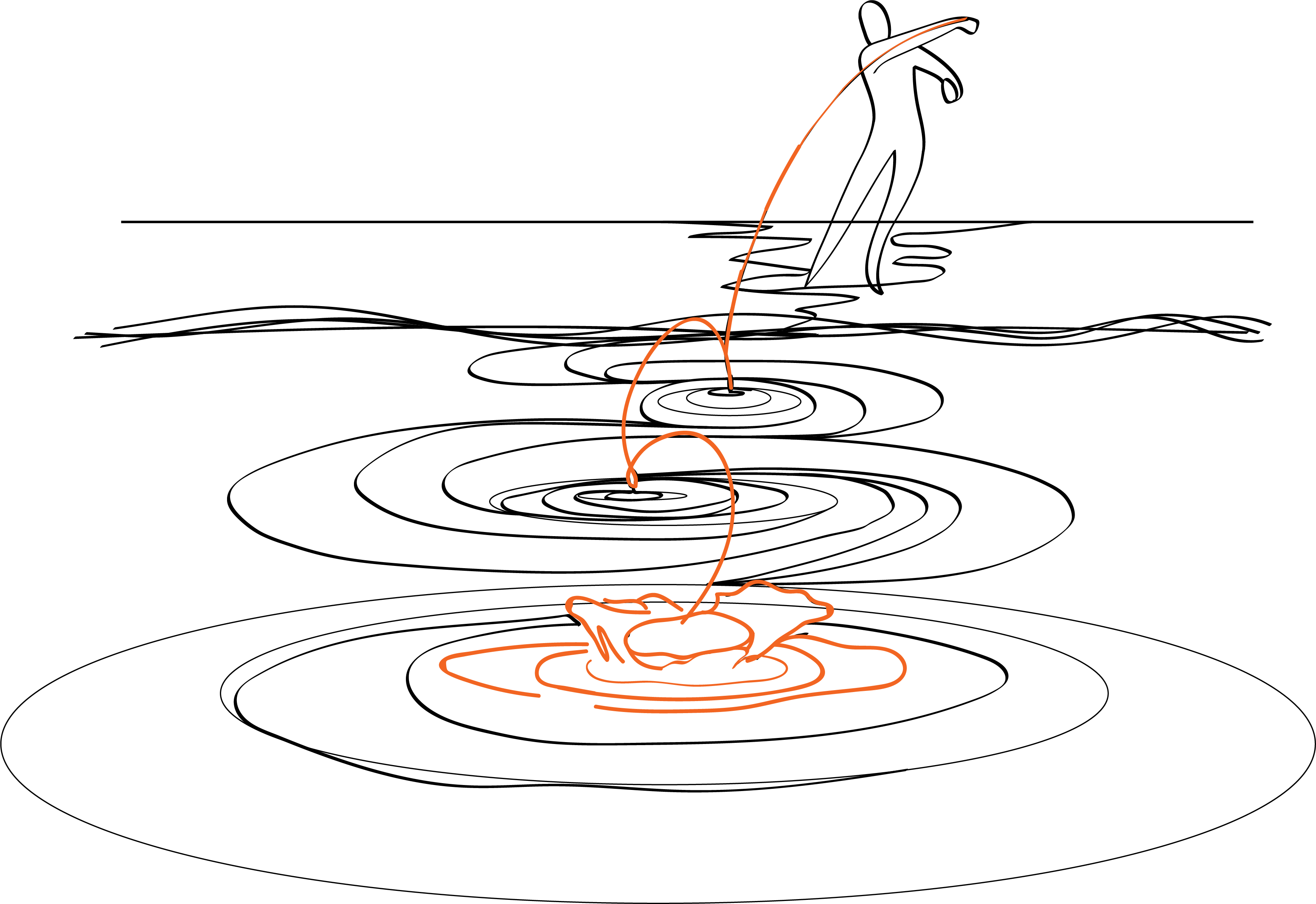
A new visual identity
You may have noticed the distinctive line drawings throughout our new site. These aren’t just decorative elements; they also symbolize our company’s origins and philosophy. The name “Orangefiery” comes from James Joyce’s “Ulysses,” a novel that revolutionized literature with its innovative storytelling techniques. Each drawing tells a story without a beginning or end, much like the narratives we help our clients design and communicate. These drawings symbolize our ability to take intricate ideas and distill them into clear, compelling messages – turning complexity into clarity, just as a simple line can form a complete image. In each of these line drawings, you’ll find a spark of orange – a vibrant reminder of our name and our commitment to igniting innovative ideas and solutions for our clients. This consistent element ties our visual identity together, representing the thread of creativity and strategic thinking that runs through all of our work.
We want to thank the team at TANKindustries for the beautiful design of our website.
We’re excited about how our new website reflects our evolution and showcases our capabilities. We invite you to explore, engage and reach out with any questions or feedback. Your insights will help us continue to refine and improve our digital presence.